
CHOOSE THE PERFECT COLOUR SCHEME FOR YOUR HOME WITH THESE EASY TIPS
Nothing is more exciting than moving into a new home and using your new furnishings and home decorating items to put your own unique stamp on your property. As you begin planning out your style and theme you’ll also need to consider what colour scheme you’d like to use in your home. When styling an interior, using a set colour palette is essential if you want your home to look balanced and professionally decorated. Too many people make the mistake of buying a collection of items they admire, only to realise that none of these accessories work together in a room.
Using a set colour palette will ground your home decor and give you some guidelines to help you navigate home shopping when you are out and about.
While choosing a colour palette may seem like an easy feat, many find themselves struggling to envision which colours work with which and how they should use those colours within their homes.
In this blog post, we give some pointers on what to consider when formulating your own colour scheme and the different approaches you can take when making your selection.

WHERE TO START?
Before choosing your colour scheme, take a good look at your space. Are there period features in your property? Does your home have wooden floors or carpet? Does your property feature exposed wood beams or a brick feature wall?
These elements need to be considered when choosing your colour scheme as there are certain colours that will complement these types of features. These complementary colours can be useful if you want to highlight these features or can be useful to have knowledge of if you want to move in a different direction.
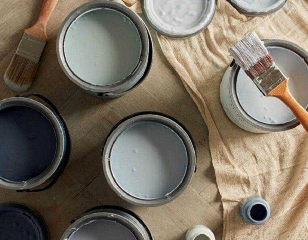
Before settling on a scheme, gather up your inspiration from home magazines, retail catalogues, online websites and inspirational social channels like Pinterest or Instagram. This will at least give you a general idea of how others have used your proposed colour look in their home.

UNDERSTANDING YOUR PERCENTAGES
Now that you have a general idea of the look you want to achieve it’s time to start planning out your colour scheme. To do this, it’s important to identify the way these colours will be used in your home.
In most interior designs, all the colours in the palette won’t be used evenly—one will be your primary colour, another your secondary colour and another your accent colour. This is at its most basic. Colour palettes can range from three to seven colours—but even then the percentage will remain similar with colours still fitting into the three percentage categories.
If creating your first colour palette, it’s best to stick to three main colours—different colour accents can be added later if you wish to incorporate even more hues into your room.
Your primary colour should account for 60-70% of your room’s colour scheme with most of that colour used on larger items like your walls, floor, and furniture. Your secondary colour should then account for around 20-30% of your room’s colour balance—mostly being used with soft furnishings. Lastly, your accent colour should be used more sparingly and artfully making up the remaining 10-5% of your colour scheme. The accent colour is often added in the form of small items like cushions, artworks, and home accessories.
REMEMBER YOUR COLOUR CONTEXT

Most people have seen the above colourful optical illusion where two differently shaded circles (one lighter, one dark) change the colour of an identical colour at the centre. The above example illustrates the way colours can interact together to change the look of an original shade. The same can happen your own colour palette—this is why deciding on your percentages is important as it can affect the way your colour is perceived to the naked eye.
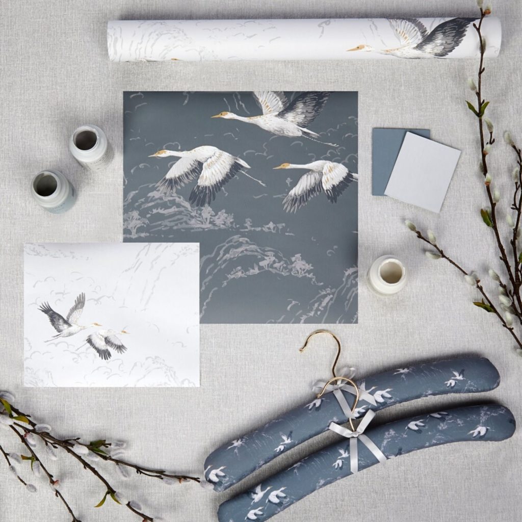
Always think about how much contrast you want throughout your design and make sure you match up your fabric and wallpaper swatches beforehand to see if any of the hues are affected before settling on a shade.
CHOOSE A COLOUR PALETTE TYPE
In general, there are four main colour palette types. These are Monochromatic, Analogous, Complementary and Triadic. These palettes all work off the colours on the colour wheel and differ depending on how much contrast you want to create in your space.
Monochromatic
A monochromatic colour palette is formulated by using different shades of the same hue as a way to create contrast without using colours from opposing sides of the colour wheel. Our Refined Elegance collection uses different shades of charcoal and steel to create a monochromatic scheme that is both elegant and sophisticated.
Analogous
An Analogous colour palette is a palette where a main colour is chosen and all other colours in the palette fall on either side of the hue. Like a monochromatic scheme this palette relies on a slight variation in shade or hue to create contrast. This type of colour palette is perfect for expressing uniformity within design.
Complementary
A common colour scheme for those wanting to make a bold statement, a complementary palette uses colours from opposing sides of the colour wheel. For a more subtle look you can play with the hues or shades of your primary colours or play with the percentage balance throughout your home to create new and exciting looks. Complementary palettes are easy to balance out and great for communicating a sense of flow through your interiors.
Triadic
Much like a Miro or Kandinsky painting, a Triadic colour scheme uses three colours from equidistant points on the colour wheel. Red, yellow and blue are the most basic of these shades. By using this method you can create a diverse colour palette that will really give your interior a unique and bold look.

CONSIDER MOOD AND ATMOSPHERE
The last thing to consider when creating a colour palette for your home is what sort of mood you want your house to have. Perhaps you want a low-lit romantic atmosphere or you might prefer a modern country look that is clean and feels fresh—or a home with pops of yellow to bring a bit of sunshine into your space. Think about your lifestyle and what colours might suit you and your family best before settling on a set scheme.
What colour scheme do you have in your home? Let us know in the comments below.